
The Lifted Brow Goes Subcompact on Your Ass
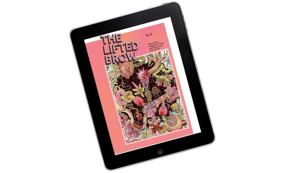
The Lifted Brow brings this lightweight publishing style to Australia.
While a lot of people are wondering about the future of journalism in general, some people are thinking about the future of just the magazine in particular. Craig Mod, once part of the team behind slick, newsreading app Flipboard, coined the genre name of a new kind of small magazine: "Subcompact Publishing". It's an interesting new form that's getting played over in the States, especially on the iPad, and most notably by the Weekend Companion of pioneeringly-profitable blog the Awl, the Atlantic Weekly and — inspiration for Mod's original manifesto — the Magazine.
Now Australian publication the Lifted Brow is throwing its hat in the subcompact ring, one of the first publications to try it over here. Though not the first, as it turns out.

The Brow is a literary mag — originally with a strong McSweeney's influence — that grew up amongst a bunch of Brisbane writing students in 2007 and now runs big name, international authors alongside local Australian talent. Now based in Melbourne, they've got a back catalogue that includes literary wunderkind David Foster Wallace, Aussie comics star Eddie Campbell and sex advice from Benjamin Law. And his mum. It's big. To say, as a reader, that each issue can be hard to finish isn't exactly a flaw: it's just that they each have so much stuff in them.

Because, First World Problems
Craig Mod's idea of the subcompact magazine is kind of the opposite aesthetic to the Brow's all-inclusive, physical incarnation. It describes a world of smaller digital publications that eschew the idea of replicating print's design, size and digital slowness.
Following his style lets you avoid a few first world problems. Downloads, for a start. A single issue of Wired on the iPad, say, can weigh in at just over 600 megabytes. A month or so of mobile phone data for some people. Subcompact-only the Magazine, by contrast, can go from pressing download in the the app, to reading its trial issue's opening story about roller derby, in about 18 seconds.
One of these small magazines will typically have just a few articles, so it's much easier to get your head around the range of stuff in it. These, and other, small usability problems addressed by the subcompact format seem really do seem like first world issues. But we read magazines for fun. It's nice not to have to kill yourself to enjoy reading one. Ease and comprehension are good things.

Less is More
Mod saw the rise of small, mostly iPad-based magazines through the historical metaphor of Honda's development of subcompact cars. In his telling, Honda's cars weren't as big or feature-heavy as the big US cars they were competing with. But they were good enough, efficient enough, nimble and cheap. He suggests that the magazines of this new digital world should take a similar approach.
An important word here is closure. The idea of internet addiction, with accompanying thoughts of switching off and the "digital sabbath", is a bit of a rising meme.
Closure isn't a thing that you run into too often online. I mean, how often do you get to the end of the internet? A lot of sites are easy to browse, but hard to finish. Think Tumblr, Twitter or Facebook.

Design = Journalism
Australian immigration detention monitor, Detention Logs had already got its subcompact on before the Lifted Brow hit the app store. It uses freedom of information requests to the Department of Immigration and Citizenship (DIAC) to gather and publish records of incidents at immigration detention centres. They have over 7000 of these records up so far, each incident encapsulated into its own tiny and individual webpage. On their Principles page they specifically single out Mod's Subcompact Publishing Manifesto alongside their other ethical and design considerations. For them, this nimble and lightweight form seems to actually be a kind of journalistic muscle.
"Small parts loosely joined" is how Detention Logs co-founder Luke Bacon describes it. He adds that using selections from Mod's manifesto publishing model is, essentially, a case of reporting form following function. "The form in which we received this information from DIAC could be seen as the opposite [of an appropriate and useful format]: one enormous, inaccessible PDF file, poorly labeled and thoroughly redacted. Transforming this complex information into easy to access and understand chunks is an act of design and journalism."

Why Change What Now?
So will "easy to access" work for the Brow? The new Lifted Brow iOS app is pretty slick. It's published by 29th Street Publishing, who put together minimalist iPad periodicals like Maura Magazine, the Awl's Weekend Companion and free, investigative subcompact ProPublica. The Brow is voluminous and dense in a way that 29th Street's publications are not. By going subcompact, the Brow is using the format both to boost, and cut through, their print legacy.
They have a strong bench. Their all-star back catalogue of local and overseas writers sold the idea to 29th Street, according to Brow Digital Director Elmo Keep. "It has a great mix: a very strong roster of international writers, and an amazing cadre of Australian writers, so it was a perfect way for both 29th Street to reach outside the US and for the Brow to reach outside Australia."
This small format makes that reach easy. Every fortnight, in a small, digestible format, you'll get the chance to catch up with new work, and their back catalogue. "It's going to be a mix of sort of teaser content from upcoming issues with reprinting stuff from the archives which a lot of people only joining us now could have missed." It will be a finite amount of short articles bimonthly, distributed via Apple's Newsstand service. There's a free trial, but the model banks on you being interested in subscribing. (Old issues will remain, if you unsubscribe.)

Pixels Make It Better
It's low maintainance. And that's no mistake. "There's so much opportunity to do things on digital that would be not be so cost effective to do in print," says Keep. She feels like a lot of the hard work has been done for her already. "I just move some things around in a content management system, and TA DA. (Not really, but kind of.)"
The plan is to split the money the digital version makes between the writers and 29th Street. "There isn't a huge amount of money to be had by anyone in this entire transaction, so we want there to be ways for writers to make money beyond what we can pay them initially [in print]." In an age where it's easy to be asked to write for free the Brow prizes paying its contributors.

PLEASE BUY OUR MAGAZINE
So the Brow's writers will get a little more money, the Brow finally gets a wider audience ("realistically, there will only ever be so many printed copies that can be produced") and the public gets a newer gobbet of casual reading. (29th Street's Creative Designer, Tim Moore, compares the subcompact style to a cheap Pengiun paperback.)
It all seems like a pretty good deal. And, on the iPad, an Aussie first. But these new digital steps aren't necessarily part of a war between online minimalism and print. "There will always be the magazine, in its dense and intense full-page glory," says Keep. "PLEASE BUY OUR MAGAZINE THANK YOU FOR YOUR TIME."
Photo of Honda N360 by Tennen-Gas, Looking for Loretta artwork by Total Bore. Revised myth of superman artwork by Colin Panetta.
Update: Luke Bacon's full email response, quoted in part for this article, is worth reading. It's up now at his blog Equivalent Ideas.


- Seven New Movies You Can Watch Right Now That Have Been Fast-Tracked From Cinemas to Streaming
- A Beginner's Guide to the Greek Islands
- California Dreamin': What Makes Mammoth Mountain an Epic Snow Destination
- Six Reasons to Eat, Stay and Play West Hollywood
- A Luxury Lover's Guide to the Food and Fashion of Beverly Hills
- Twelve Films and TV Shows You Need to Stream This Month