Maligned Comic Sans Font Gets a Minimalist Neue Makeover
Passive aggressive workplace notes have never looked better. Meet Comic Neue.
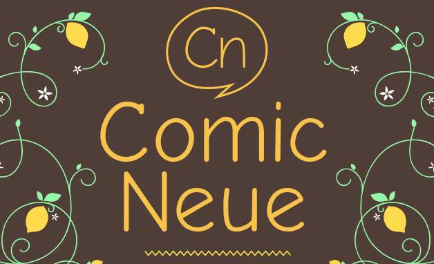
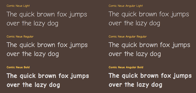
Telling your co-workers to wash their damn plates has never looked so suave. Comic Sans, the "I'm not like a regular mom, I'm a cool mom," of the font world, has been given a streamlined, minimalist makeover and is lurking dangerously close to legitimate suavity. Taking cues from the more sophisticated typography go-tos like Helvetica Neue, Comic Neue could potentially be suited for more than passive-aggressive staff kitchen notices and school canteen specials.
Constantly scorned for its combination of rounded edges and likeness to the Foundation Handwriting font taught at preschools, Comic Sans has long worn the crown for biggest lamebot in the font family. Writers at McSweeney’s tried to convince us otherwise, but until graphic designer Craig Rozynski decided to give the font a new pair of pants, it was doomed to the Angelfire blogs of yesteryear.
Japan-based Australian designer Rozynski saw an overlooked elegance in the world’s most ridiculed font. “Comic Sans wasn’t designed to be the world’s most ubiquitous casual typeface,” he says on the font’s own website. “The squashed, wonky, and weird glyphs of Comic Sans have been beaten into shape while maintaining the honesty that made Comic Sans so popular.”
Sporting a makeover to rival Rachel Leigh Cook’s She’s All That staircase descent, Comic Neue is sure to score all the invites to prom with its new schwanky look. Rozynski believes teaching a an old dog new tricks will impress even the biggest font snobs. “Comic Neue aspires to be the casual script choice for everyone including the typographically savvy.”
You can test drive Comic Neue over here for free for a limited time. Go on, lightly warn the good people about the consequences of taking people's fridge food. It's going to look damn classy.
Via Mashable.


