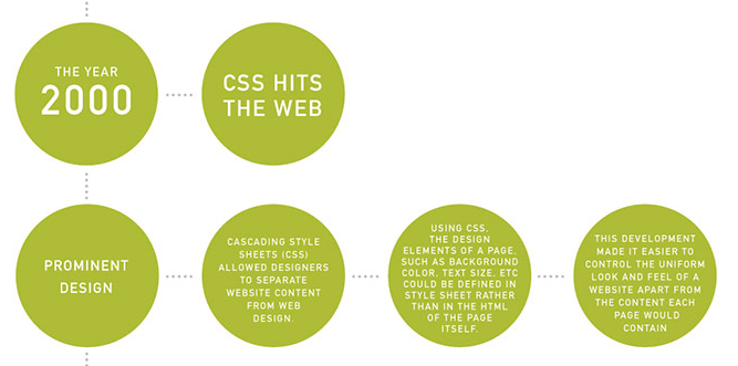
The Evolution of Web Design over Two Decades [INFOGRAPHIC]
The internet has become a more friendly, accessible and interactive animal over the past two decades. Here is an incredible infographic that maps out the role design has played.
There was a running joke in my year 12 cohort about setting up a GeoCities site to rival Google. With regard to search capabilities it would be a carbon copy but design is where we would come into our own, lining the site with as many animated GIFs (flying toasters and dancing bears would be our trademarks), flaming borders and flashing neon WordArt as our dial-up bandwidth would allow. The dream died along with GeoCities but the memories all came flooding back when I looked at the latest creation of KISSmetrics.
The clever tech-heads have compiled a graph meticulously analysing the last two decades of the internet's design development. Looking at the growth of the internet from a bird's-eye view reveals the creation of a more friendly, accessible and interactive animal. What was once the domain of text heavy reference resources gradually opened up to more user-generated websites as technology became more accessible.
With the advent of Web 2.0 in the late 2000s, the focus shifted from the web as an access point for information to a place of creation: using the web to network, create and share ideas, and all in an increasingly mobile fashion.
[Via Mashable]


