McDonalds Goes Minimalist with New Paris Design Campaign
mcdnlds trns mnmlst.
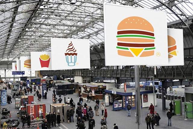
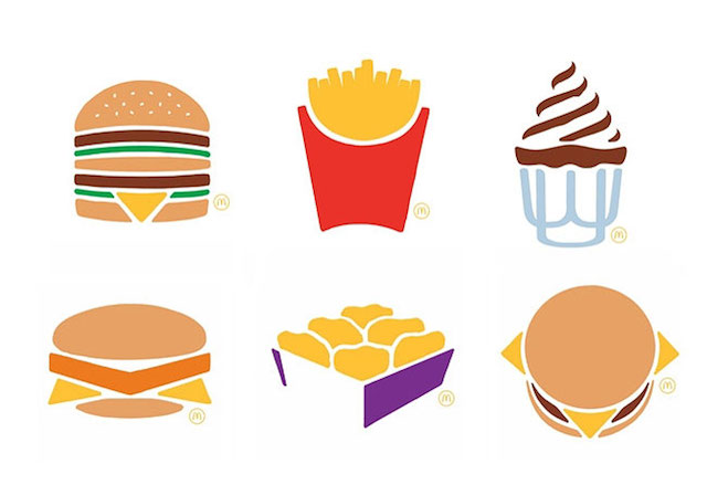
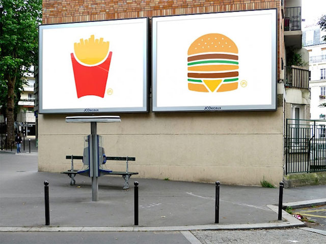
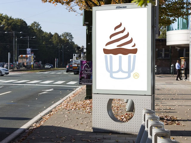
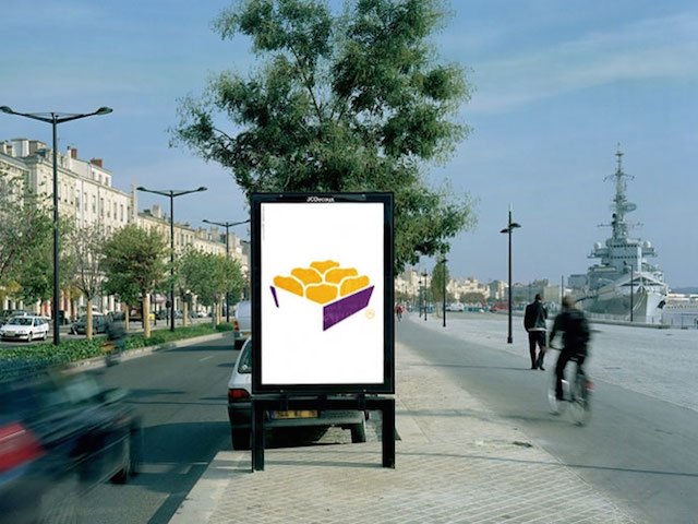
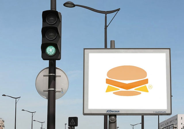
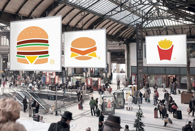
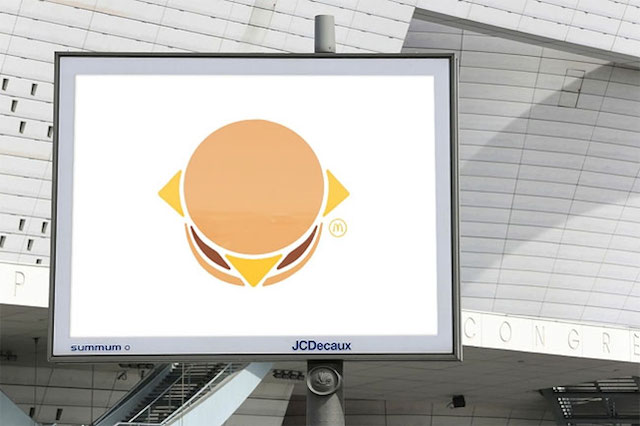
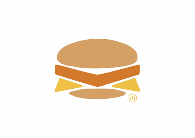
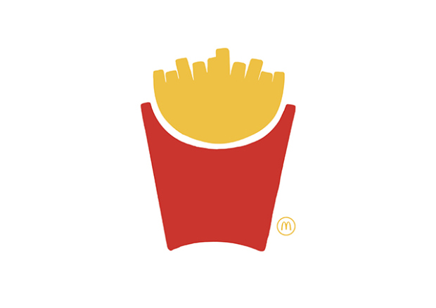
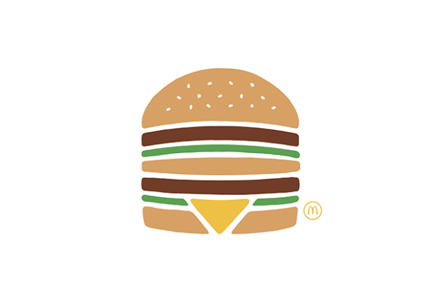
Stripping back the Big Macs, McDonalds is set to reveal its latest campaign in Paris — with no staged food styling in sight. Developed by TBWA Paris as a 'Pictogram' campaign, McDonalds' new billboards see paired down classics like chicken nuggets, fries and Big Macs (which all look undeniably stylin').
One of the world's most easily identifiable brands, McDonalds' minimalist campaign exposes how ingrained their products are in consumer consciousness. Creative director Jean-François Goize, copywriter Frank Marinus, and art director/illustrator Michael Mikiels are capitalising on your nomming muscle memory to fill in the gaps. TBWA London paved the way with this type of advertising campaign with their No Logo strategy for FCUK, with Lego picking up the logo-less brand identification technique for their 2012 ads. Imagination is the key.
Business Insider pointed out that "most men, women, and children in the world know the Mickey D's staples like they know their own names." ABC found that kids were learning to identify logos before their alphabet.
Check out the campaign below, alongside TBWA's Azealia Banks-fuelled ad, full of highly attractive, youthful 'street artists'.
Via Business Insider.
