US Political Maps
Mark Newman's monstrous election maps are more realistic than regular maps, and scarier.
Conventional maps of political results seen in the media, in stats and in reports often demonstrate a skewed and non-inclusive representation of the outcomes of US Presidential Elections. This then creates a politics of maps. However, Mark Newman, a renowned complexity researcher, has attempted to abate the confusion behind these inaccurate portrayals by creating his own highly inclusive and bona fide images.
Newman believed the representations of states coloured by the majority votes was insufficient. Not only do these maps fail to take population into consideration, but they also demonstrate democratic or republican voters in each state as black and white, or in this case blue and red, rather than showing the many shades in between. After billions of dollars and years of incessant campaigning, surely an authentic portrayal of the election results is not too much to ask. Newman has answered this call by creating more realistic and more complex illustrations of the election results.
First, view the varying processes Newman went through in accurately depicting the 2008 presidential elections, followed by his political map of the most recent 2012 election.


2008 Election Results By State
With red depicting republicans and blue democrats, this widespread map of the 2008 Presidential Election is obviously a vast illusion, as one would not be wrong in mistaking the winner as McCain rather than Obama.

2008 Election Results Population Cartogram
This more precise depiction instead shows the election results compared to the population sizes of each state. The fact is that the red states often have a lower population than the blue, thus increasing the proportion of blue in this image and eradicating the sea of red in the previous one.

2008 Election Results by County
Rather than assuming an entire state is a homogenized mass holding a single political view, this map shows the electoral votes in each county of the US. Again, however, this image is incredible deceptive and misleading.

2008 Election Results by County Population Cartogram
Using the same technology as before, this map demonstrates the results of the election by county, according to population. Once again this makes the balance between red and blue more accurate, however, this is much more specific and localized to certain areas.

2008 Election Results by County in Shades
Forget 50 shades of grey, what we want to see is 50 shades of purple. To closer resemble the balance that exists within states and the nuances in voting patterns, Newman used varying shades of purple rather than simply two block colours. This eliminates the vast mass of red or blue spreading over particular areas and demonstrates that the country is not actually starkly divided.

2008 Election Results by County in Shades Population Cartogram
Combining all the complex techniques above produces this truthful and reliable depiction of the election results compared to population per county. Much more accurate than the first map given!

2012 Election Results
And now for the long awaited images of the recent 2012 US Presidential Election. Here is the image of the standard and simple map of the election results of Romney VS Obama. Not too distant from the image we saw from the 2008 Election.
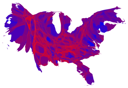
2012 Election Results by County in Shades Population Cartogram
Here is the more authentic portrayal of outcomes from the 2012 election using population per county and shades: an up-to-date representation of America's voting patterns that couldn't be much more accurate.


- The Ten Best Hotels in Brisbane
- The Best Glamping Sites Around Australia
- Predicting the Oscars: Who Should, Could and Will Win at the 2025 Academy Awards
- Ten of the Most-Unique and Relaxing Stays You Can Book Around Auckland
- Unique Stays with Breathtaking Views of New Zealand's South Island
- The Most-Impressive Group Stays You Can Book in Byron Bay