Information is Beautiful
Get lost pie charts. Infography is where its at.
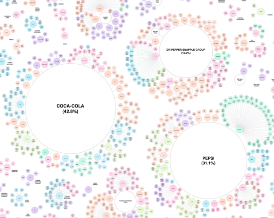


Pie chart? Pfft. Line graph? Whatever. Histograms? Give me a break. It's all about infography, the visual explanation of complex data, and Information is Beautiful is the best of the infographical best.
It's the pet project of David "I Hate Pie Charts" McCandless, a designer/data addict. In a world of much-bemoaned "information overload", McCandless is passionate about visualising information - facts, data, ideas, subjects, issues, questions - so we can see patterns and connections between them.
And he doesn't just focus on the Important Data - rising sea levels, contrary election polls or that pesky Icelandic volcano. No, Information is Beautiful doesn't discriminate. McCandless looks at everything - time travel in popular film and TV, the hierarchy of digital distractions ("Anything Happening on your iPhone" takes out the top spot - surprise surprise) and the pseudovariety of soft drink.
McCandless has even put out an Information is Beautiful book, with 200 new images that use information design to "explore a whole range of subjects visually, from pop to philosophy, all with the mininum of words, natch."
Poor ChartWizard, maybe it's time to hang up the towel?


- The Ten Best Hotels in Brisbane
- The Best Glamping Sites Around Australia
- Predicting the Oscars: Who Should, Could and Will Win at the 2025 Academy Awards
- Ten of the Most-Unique and Relaxing Stays You Can Book Around Auckland
- Unique Stays with Breathtaking Views of New Zealand's South Island
- The Most-Impressive Group Stays You Can Book in Byron Bay