Use Your Design Skills to Change the Way We Comprehend Nutrition
Do you have what it takes to redesign the nutrition label to make sense out of confusing percentages, milligrams, serving sizes and calorie counters?
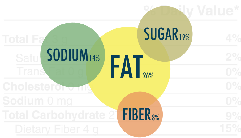
Could 2011 be the year of the infographic? They're all over the internet: eye-popping visuals which make sense of complex data sets through bright colours and great typography choices. In a world where information bombardment is enough to make your head spin, infographics are bringing order to the chaos of endless facts and figures.
Perhaps the logic of the infographic could be applied to the design of nutrition labels, another daily dose of confusing percentages, milligrams, serving sizes and calorie counters. US magazine Good has teamed up with the University of California Berkeley Graduate School of Journalism's News21 project, inviting designers to rethink food labelling.
Their instructions? "Redesign the food label. Incorporate the existing nutrition facts and calorie counts. Or reimagine a label entirely based on food quality, food justice, or lesser-known chemosensory characteristics. Consider a food's carbon footprint or its cultural significance. Above all, make the redesigned label informative, instructive, and memorable."
Enter the competition before July 1 and use your design skills to inspire better food and nutrition literacy.


[Via Good]


- The Ten Best Hotels in Brisbane
- The Best Glamping Sites Around Australia
- Predicting the Oscars: Who Should, Could and Will Win at the 2025 Academy Awards
- Ten of the Most-Unique and Relaxing Stays You Can Book Around Auckland
- Unique Stays with Breathtaking Views of New Zealand's South Island
- The Most-Impressive Group Stays You Can Book in Byron Bay