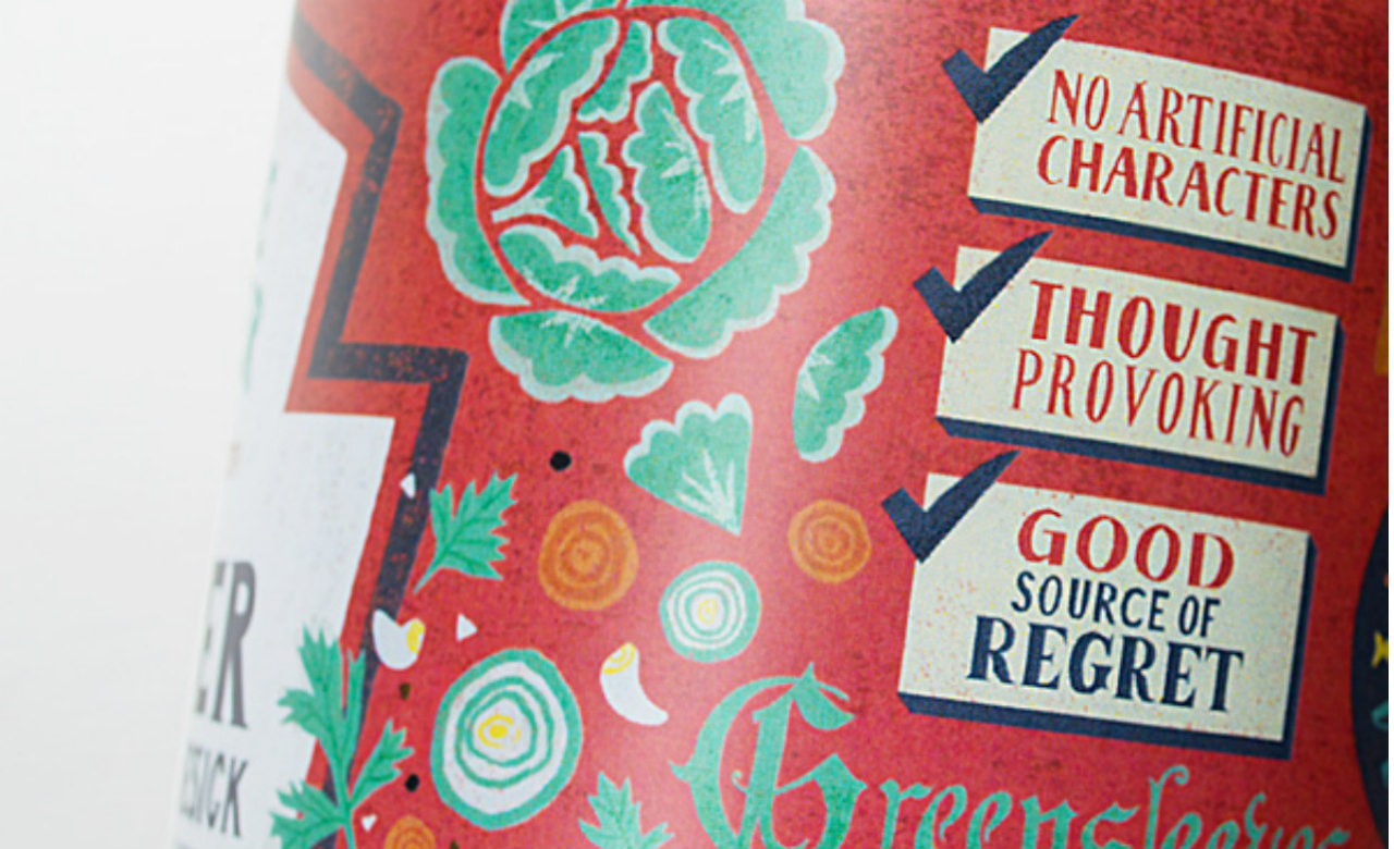
Classic Novels Redesigned as Adorable Food Cans
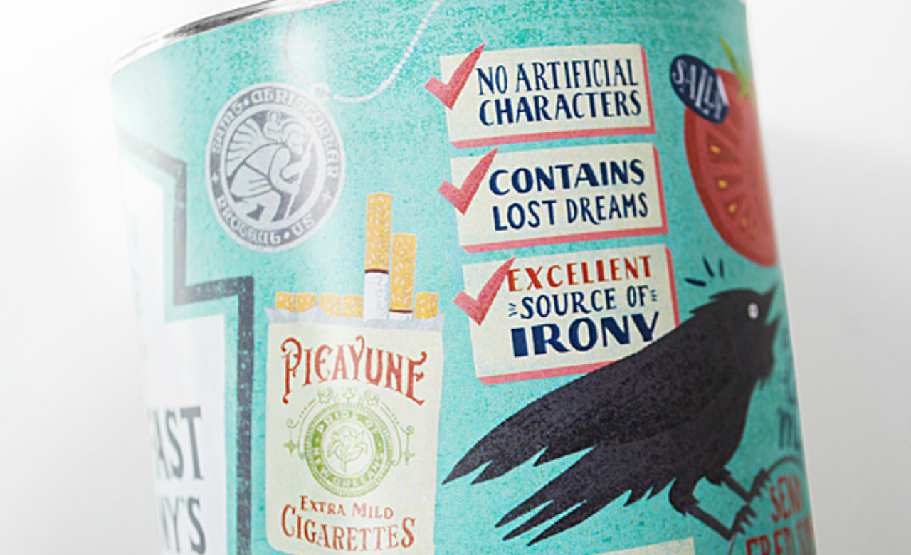
"Excellent source of irony. No artificial characters."
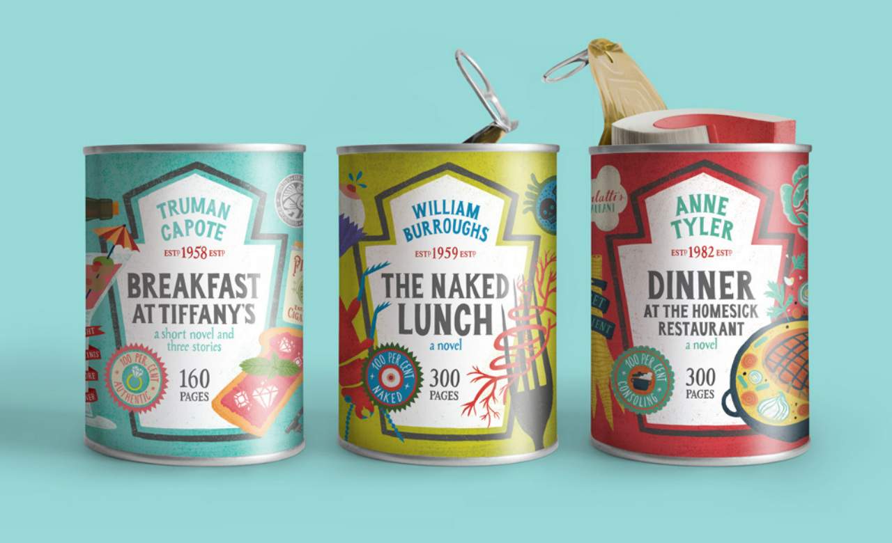
As any published author will tell you, settling on a cover design is tricky. But California-based designer Maria Mordvintseva-Keeler has come up with a novel approach. She's repackaged classics in cans — with labels that reveal their 'ingredients' without giving away their storylines.
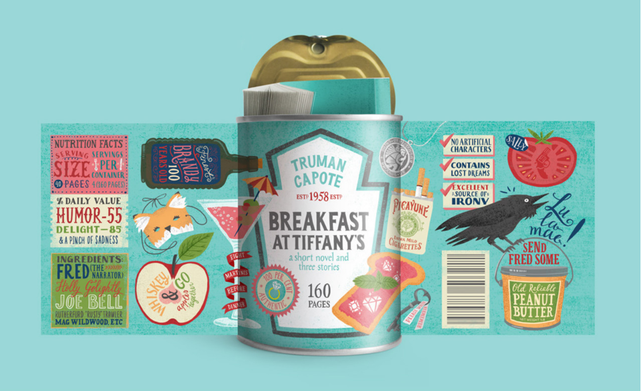
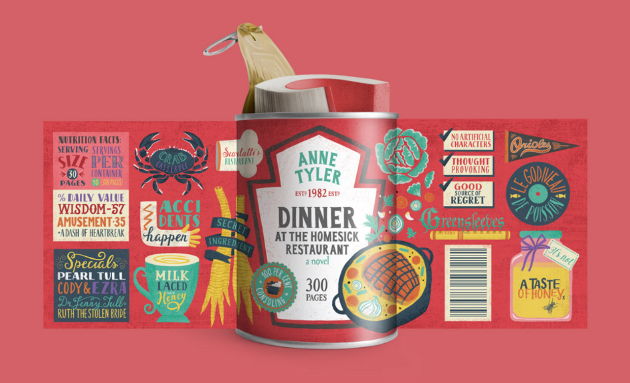
Titled Food for Thought, the design series features three classic books, each of which contains a foodie reference in its title — Truman Capote's Breakfast at Tiffany's, William Burroughs' Naked Lunch and Dinner at the Homesick Restaurant. The label lets the reader know if the book suits his/her mood and literary diet. Breakfast at Tiffany’s, for example, reads:
"[It] has the characters, serving size, with the number of pages, and emotions in the daily value sections," Mordvintseva-Keeler told Mashable. "I sometimes wish they featured something like that on the cover, since the right book at the right moment is better than any sort of therapy. Reading is certainly better than stress eating."
Originally from Moscow and now based in San Diego, Mordvintseva-Keeler's previous projects include Packaged Pets, which promotes the adoption of animals from shelters; EcoBag, a biodegradable plastic-bag replacement containing seeds (and similar to these coffee cups); and Bold as a Rooster, a typographical study exploring the "potential of roosters’ combs, feathers and legs to become legible letters". Take a leaf out of this artist's book.
Via Mashable.
Images: Maria Mordvintseva-Keeler.
