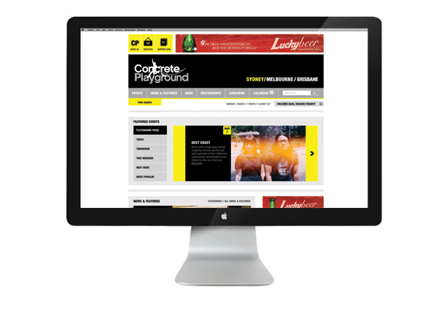
The new look Concrete Playground
We've nipped, tucked and delivered Concrete Playground to you in a shiny new package, re-imagining everything from the ground up.
You may have noticed, dear readers, that things look a little different here at Concrete Playground today. Indeed, our troop of absurdly brilliant writers, coordinators, editors, designers and developers have been working tirelessly over the last few months, preparing to make Swiss cheese of the stratosphere with the launch of a new and much improved website. We've nipped, tucked and delivered Concrete Playground to you in a shiny new package, re-imagining everything from the ground up.
So, what exactly has changed? For starters, we'll be introducing a few of our new favourite toys...
We have developed a custom Facebook application that lets you seamlessly integrate your new Concrete Playground user profile with the world's biggest social network, mapping out your social schedule to share with friends in just one click of a button.
We have also created a shortlist of the city's best restaurants and bars, reviewed by some of this town's most fervent foodies, which includes a fancy geolocation tool that allows you to choose a place to dine or drink based on your current location or the place's proximity to an event you are planning to attend.
And we have created some entirely new types of content, which will appear with daily regularity in our new News & Features, Featured Video and Galleries sections.
Of course, you can expect the carefully and lovingly selected event coverage you have come to know — only more of it, and with things like dynamic event calendars and tailored recommendations to help you find what you are looking for. We're opening our doors in Brisbane today, and will be launching editions in Melbourne and Auckland in the next few weeks.
We are big believers in design and functionality, and were very fortunate to find world class creative partners in Canvas Group and Etc Etc Awesome who designed and coded, respectively, the bejesus out of this thing. We have also received some very useful feedback from our readers and writers over the 18 months since our launch, and this redesign represents a consolidated viewpoint on exactly how best to publish an entirely online (for the moment, anyhow) cultural publication.
This is not the end of our design process, but the beginning. We will be adding new features and optimising existing ones as we go to make the user experience a more dynamic, alive and intuitive one. Your feedback has been and will continue to be of great value, so please let us know what you think via Facebook, Twitter or Email.
And last of all, a big thank you to everyone who has contributed - particularly the editorial team led by our wonderful head honcho, Anna Harrison - and to you, our readers, for your loyal and passionate support and advocacy. Please continue to spread the word and help an independent group of writers and editors start something big.


