Overview
Facebook is swiftly becoming the radar of global activity, now obtaining the power to track not only people's social networking patterns but also their travel paths, their ages and even their political inclinations. With over 800 million active users the social networking site is rampant, with immense data processing required for the constant stream of check-ins, status updates and photo uploads.
Data scientist at Facebook, Justin Moore, created these global maps as a captivating visual indicator of where and who the world's Facebook users are to make sense of some of the unique data.
SEASONED TRAVELLERS WHO WANT TO MAKE IT KNOWN
Forget the old maps of showing aeroplane's routes across the globe because we can now follow travel patterns through Facebook users' check-ins. This map uses check-ins at two far off locations as a way of tracing globe-trotting journeys.
NYC HUSTLE AND BUSTLE
Check-ins over several days in New York City alone reveal the heavier users are situated around more heavily trafficked commercial and tourist areas. Shouldn't you guys be working or studying or something?
NEW VS. OLD
The colour ranges of this dazzling map represent the ages of users, again through their check-ins on Facebook. The green zones constitute the older and more established Facebookers whilst the blue are the younger rookies.
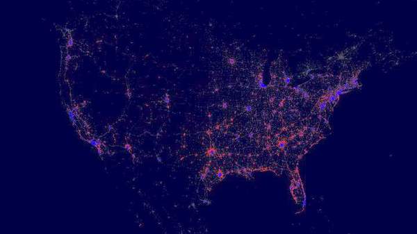
PRETTY POLITICAL
Although what may look like some sort of beautiful and rare star constellation, this last image actually maps American users' political affiliation. Democrats are shown as blue and the Republicans are red. Better pick up your game Obama, the social world has spoken.
