Interview /// Concrete Playground talks to Gemma O’Brien
Gemma O'Brien in an Australian designer/typographer traveling the world with her fonts and felt pens. After her guest appearance at Semi-Permanent Brisbane last week, Sarah Hazlehurst catches up with Gemma for a recap for those who missed out on the creative conference.
How would you describe to others what you do for your job?
I work mainly with typography, illustration and print design... but it's not limited to that. I particularly like starting all my projects by drawing. The majority of my commercial commissions tends to be illustrated custom lettering pieces. Some art pieces end up being installations and while I was working at Animal Logic earlier this year I tended to be designing more for TV. At my most recent project there I directed new opening title sequence for Play School – it featured no typography and was stop-motion piece with hyper-colourful paper sculpture I built and was brought to life by the talented team at Animal.
Where did you passion for typography begin and why?
To be honest, my first encounters with typography were dull! It seemed like the boring, technical rule-based side of graphic design. But this view was changed drastically after working in the letterpress studio. I also started seeing type as a visual element. It could speak as loudly as image and take on lyrical or illustrative qualities itself.
Your 'Write Here Right Now' campaign was amazing. Do you have any new campaigns in the making?
I am currently focusing on forms of typography that exist outside the commerical domain. For my Honours paper at COFA I am researching lettering and typography of headstones and I will hosting a workshop at the Paper Mill gallery in Sydney in September that looks at letterforms on buildings.
Who is your favourite artist and why?
Today's type designers: Tobias Frere Jones, Jonathon Hoefler, Gerard Unger, Ale Paul from Sudtipos
Type history's legends: Stanley Morrison, Jan Tschichold,
Illustrative type heroes: Jessica Hische, Seb Lester, Marian Bantjes, Luke Lucas
And Australia's original typophile: Stephen Banham
What inspires you to create new fonts?/What's your favourite font to write with?
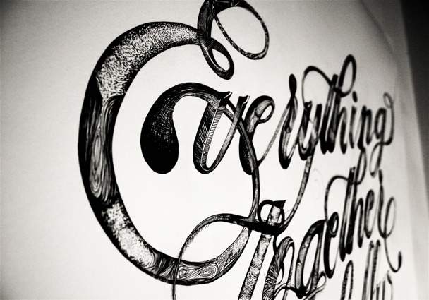
Well you can't really "write" with fonts. A lot of what I do is actually lettering - drawing letterforms is often inspired by existing fonts but is quite different in its execution. While a font is designed to be used in any application - any context a designer sees fit - lettering is often a custom piece designed specifically for a certain word or phrase. In lettering, you're often looking for particular relationships between letters that could be drawn and linked in particular ways. That said I like drawing letterforms that are fluid and organic...lend themselves to swashes and flourishes.
Do you have a favourite sentence to write?
Not really, it's always changing. I'm always listening out for interesting sayings, quotes, conversations, song lyrics or poetry that has a certain appeal to be developed into a piece of lettering or typography.
Are you a lover or a hater of the quick brown fox ... ?
Well the quick brown fox has a little more appeal than the lazy dog.
If Times New Roman always a no-go?
Of course not, Stanley Morison, the designer of the typeface Times New Roman is a legend and one of the key designers in the early twentieth century who influenced the shape of typography today. It's really only became a faux-pas through familiarity, accessibility and therefore frequency of use.
What is the worst letter to write? None of them are that bad! Although I do lean towards letters that lend themselves to flourishes....K's and M's... I love them all equally.
Why do you think typography is important to our developing world?
Typography and lettering are the markings of human culture. Just imagine a world without letters...! They are the greatest human invention ever! These little shapes that over time have developed into what we recognise so immediately that as individual letters they become invisible...and we just take the meaning from the word the create and the context they are in. They are the visual marks that can communicate, sell, tell a story and convey information, through typography these letters speak to us.


- Dark Arts, Hedonism and Exploration: A Weekender's Guide to Visiting Hobart for Dark Mofo
- The Best Australian Fashion Labels to Know Right Now
- CP Picks: The Best Gifts for People Who Are Never Home — According to Travel Writers
- The Ten Best Hotels in Brisbane
- The Nine Best Coastal Spots for Whale Watching Across Australia
- The Best Pubs in Brisbane for 2026