Stunning Satellite Maps of Storms
Stunning satellite photographs capture hurricanes, earthquakes and wildfires across the globe throughout history.

The omnipresence of satellite imaging, thanks particularly to our friends at Google, has meant we have become increasingly desensitised by the awesomeness that is mankind's ability to take detailed photographs of our neighbour's backyard from thousands of kilometres up into space.
However, every so often we stumble upon images that reignite our wonder in our seemingly endless technological capacity and the epic majesty that is the natural world.
These satellite photographs from John Nelson, a mapping manager at data visualisation company IDV Solutions, capture hurricanes, earthquakes and wildfires across the globe using colour coding and cutting edge data visualisation technology to beautifully and innovatively map some of the most devastating storms throughout history.


11 Years of Major US Fires
After devastating fires blazed across Utah and Colorado earlier this year, Nelson gathered satellite imagery from NASA to visually map the spread and intensity of wildfire across the US over the last 11 years. The differing colours represent the intensity of the fire as compared to the average output of a nuclear power plant during Summer. The bright yellow spots, spread primarily across the West Coast, represent fires burning at a heat and intensity of roughly three or more nuclear power plants, with the hottest recorded at approximately 14 nuclear power plants in June, 2005.


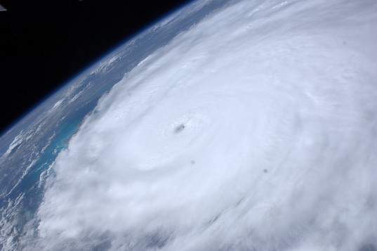
Every Hurricane and Tropical Storm Over the Last 150 Years
With the help of a plethora of data from the National Oceanic and Atmospheric Administration including wind speeds, dates and names, Nelson was able to map every hurricane and tropical storm over the last 150 years. Using this data along with some educated predictions about the movements of 19th Century storms, Nelson "slapped it on a polar projection" and added some colour coding depicting storm intensity to create these incredible images. The maps however serve much more than an artistic purpose, with Nelson creating them in the wake of Hurricane Isaac in order to assist meteorologists in analysing storm trends and even allowing us to detect storms before they have occurred.

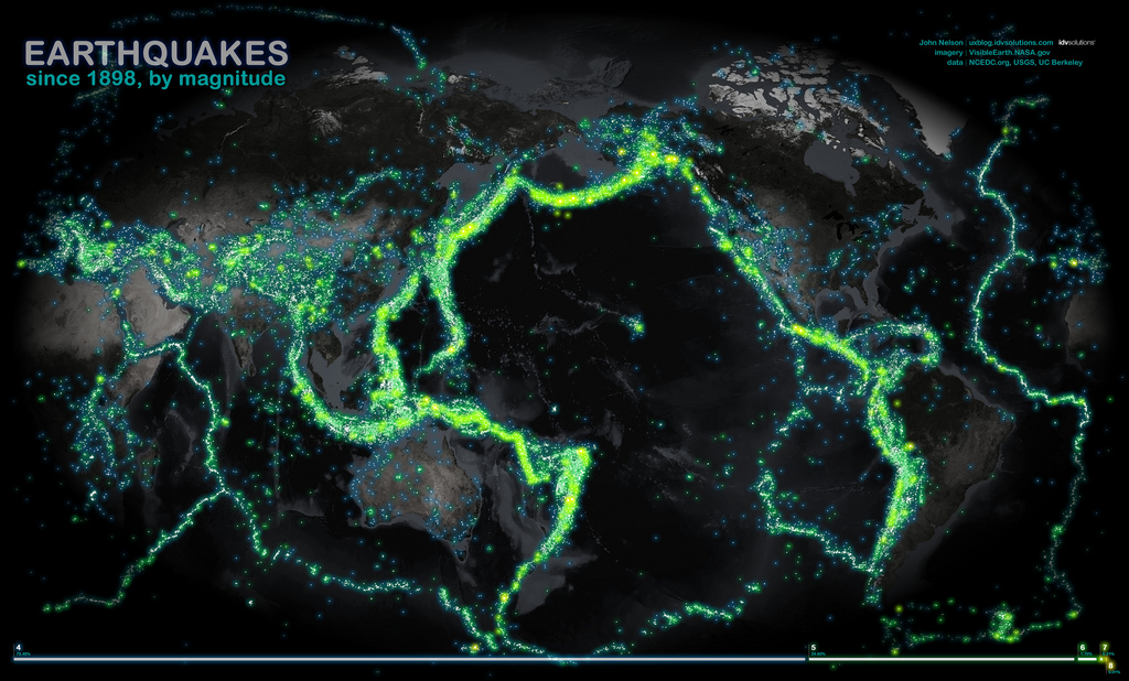
The World's Earthquakes Since 1898
This map provides an awe-inspiring view of the tectonic boundaries of the Earth's surface. The yellow and green glow represents every earthquake over the last century that measured 4.0 or over on the richter scale, with the more luminous the glow the higher the magnitude of the earthquake.


- Dark Arts, Hedonism and Exploration: A Weekender's Guide to Visiting Hobart for Dark Mofo
- The Best Australian Fashion Labels to Know Right Now
- The 12 Best Walks In and Around Sydney
- Sydney's Best Bottomless Brunches
- CP Picks: The Best Gifts for People Who Are Never Home — According to Travel Writers
- The Ten Best Hotels in Brisbane