Aesop Opens New Osaka Store with Minimalist Cedarwood Design
We're inhaling the cedarwood and parsley seed from here.
As if Aesop didn't already lure us in with their disarmingly aromatic street samples, they've gone and fitted out their newest store with rich, glorious cedarwood. Teaming up with Japanese design and architecture firm Torafu Architects, Melbourne skincare and all-the-nice-things brand Aesop has unveiled the interiors for their latest chapter in Osaka.
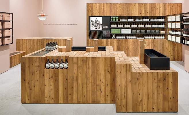
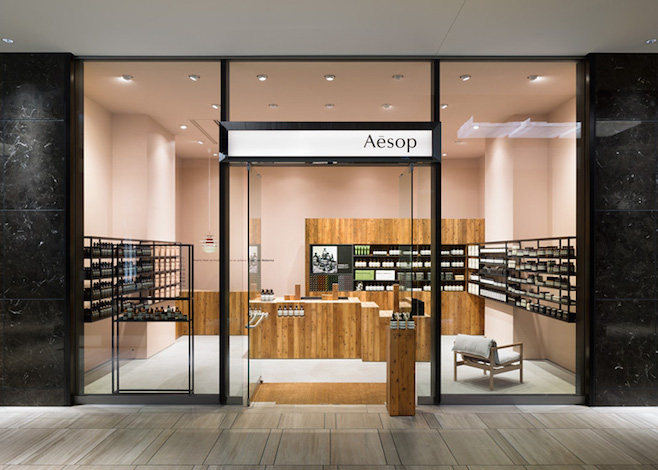
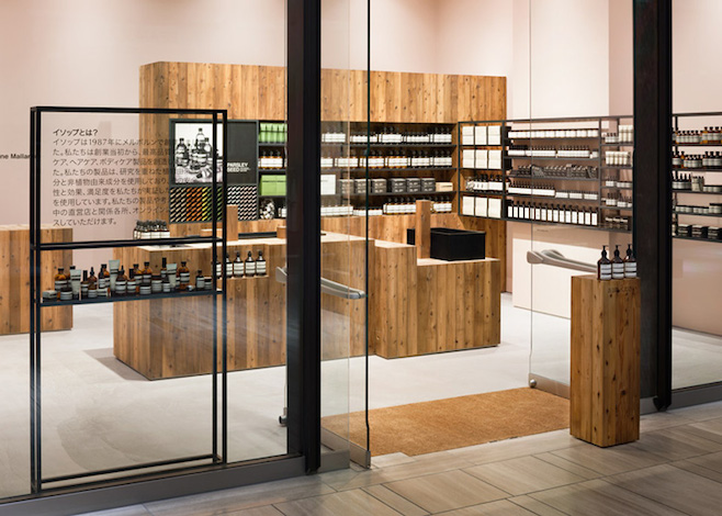
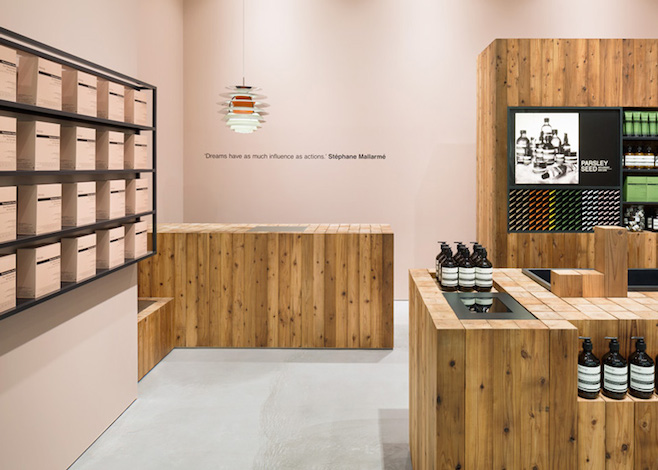
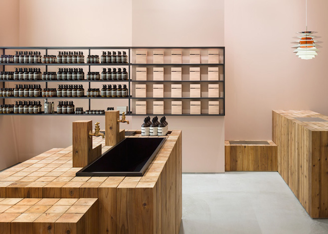
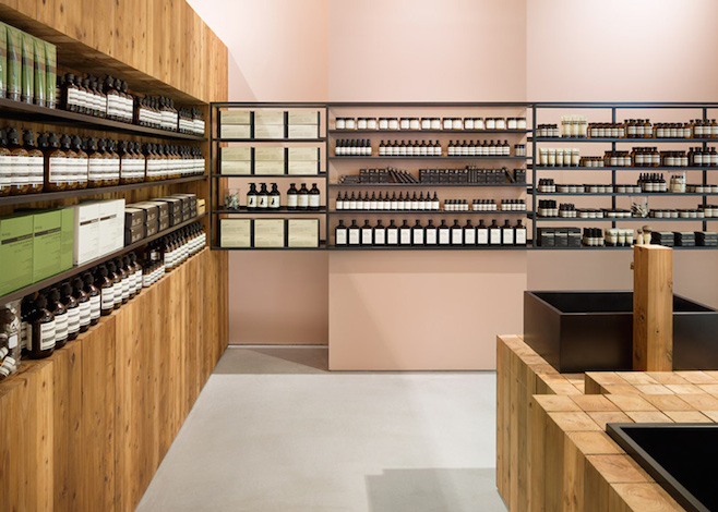
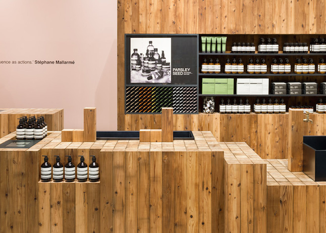
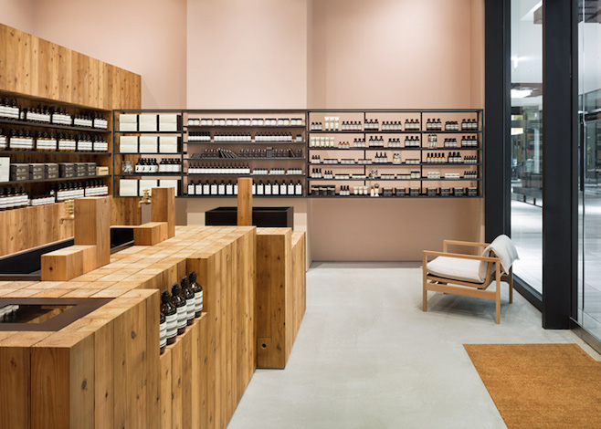
Snuggled in the Grand Front Osaka Mall, the seven square metre space is a delightfully minimal celebration of cedarwood, with shelves, islands and counters all super sleek blocks of once-baked pillars. Pairing down their interior design to match the stripped back branding of the products, Aesop worked closely with Torafu to be the prettiest kids on the block.
"We wanted to create a natural feeling against the cold glass and stone materials decking the promenade. Looking for local materials, we found the once-baked Japanese cedar wood pillars," said Wei Ting of Torafu Architects. "When we presented the material choices to Aesop, they suggested using the pink colour for the walls.
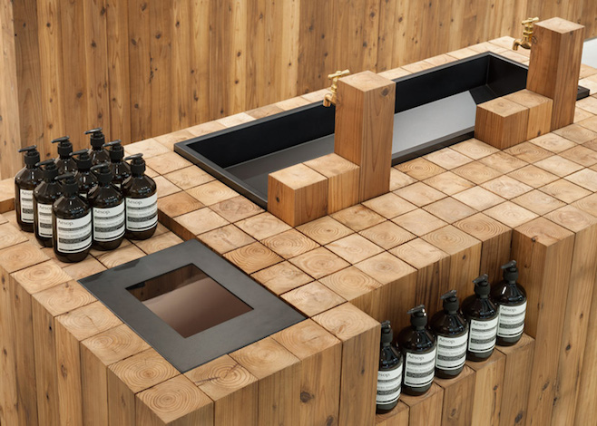
"While the rough veneer of the Japanese cedar creates a contrast with the homogenising effect of its surroundings, the top surface of the squared logs of varying length are punctuated by aptly placed sinks, thereby bringing about a soothing sense of rhythm to the store." Gotta love an aptly placed sink.
Started in Melbourne in 1987 and seeing its first in-store customers in 2004 at a former underground carpark ramp space in St Kilda, Aesop are slowly infiltrating the world skincare market one unique store at a time, from Berlin to London's Covent Garden, the Hamptons to Shibuya, Tokyo. The makers of mindblowing moisturiser opened a rustic, oak and copper-clad store in Hong in February 2014, covered the roof of their December 2013 Chelsea, NYC store with one thousand different covers of literary journal The Paris Review and just months earlier used fruit picking ladders to quaintify their Marylebone, London store. Not to mention the myriad of pop-ups they've cranked out over the years, Aesop has realised over 25 instalments worldwide now.
Founder Dennis Paphitis told Dezeen he was "horrified of the thought of a soulless chain," and aimed to invest time and significant funds toward unique design for each store. "There's a direct correlation between interesting, captivating store spaces and customer traffic within a store," he said. "I’ve always imagined what we do as the equivalent of a weighty, gold charm bracelet on the tanned wrist of a glamorous, well-read European woman who has travelled and collected interesting experiences. I felt and still do that it should be possible to grow in a lateral way without prostituting the essence of what the company is about."
Now for some solid design porn. Here's Aesop's new cedarwood-clad, super sleek Osaka joint:
Via Dezeen. Images by Takumi Ota.
